Visual identity components
Wordmark
This is the primary representation of our brand.
One color reverse
One color positive

Icon
To be used for social media, as a footer or document sign-off, and other vetted applications.
On documents, the icon should typically be placed in the lower left-hand corner.
When using the icon, it is preferable to have the wordmark elsewhere on the communication and as the leading brand element.
Color
Additional colors can be proposed as deemed necessary by any staff member. Additions require Nick’s approval.
Typography
Univers and Bodoni will no longer be used on communication materials.

Typesetting
The type and leading at right is based on letter-size and tabloid documents. Please scale proportionately for larger or alternate needs.
Use optical kerning on both typefaces. Set the tracking of Whitney to -10, and the tracking of Tisa to 0.
Hierarchy of the two typefaces and alternate font weights can be proposed as deemed necessary by any staff member. Modifications require Nick’s approval.
| H1 | Whitney Light 36/42 |
| H2 | Whitney Light 24/28 |
| H3 | Whitney Book 12/14 |
| H4 | Whitney Semibold 10/14 |
| Body | Tisa OT Light 10/14 |
| Tables/Captions | Whitney Book 9/12 |
Use sentence case for all headlines
Use Sentence Case for All Headlines
Company name
Ensure that the name Beveridge Seay
does not break across two lines.
Ensure that the name Beveridge
Seay does not break across two lines.
Typography
Whitney is used for headlines
Tisa OT is used for body copy. Qui vel moditatia nate samenia soloreriat alit eati doloruptaque culliqui a debis estiusam et il eosa consectorro dolorrumquam faceri dolore niaspi.
Whitney is used for headlines
Tisa OT is used for body copy. Qui vel moditatia nate samenia soloreriat alit eati doloruptaque culliqui a debis estiusam et il eosa consectorro dolorrumquam faceri dolore niaspi.
Abstract iconography
These icons may be used as abstract graphic elements or to add visual interest to communications. Multi-color and analogous color variations are available.
Additional icons can be proposed as deemed necessary by any staff member. New icons require Nick’s approval.
Multi-color
Analogous color
Representative icons
These icons may be used as abstract graphic elements or to add visual interest to communications. Multi-color and analogous color variations are available.
Additional icons can be proposed as deemed necessary by any staff member. New icons require Nick’s approval.
Conceptual illustration
On rare occasions where a conceptual illustration is desired, the styling should make use of solid color forms with simplified details.
This approach should be used for selective clients, when the illustration style may resonate.
Base illustrations can be sourced from Shutterstock, using the key words “flat vector illustration.” Color should be modified to reflect the Beveridge Seay palette.

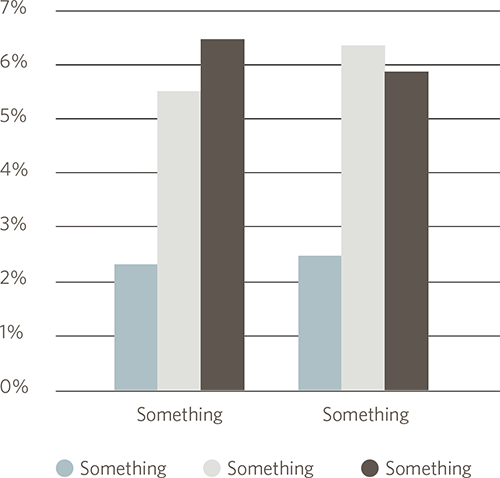
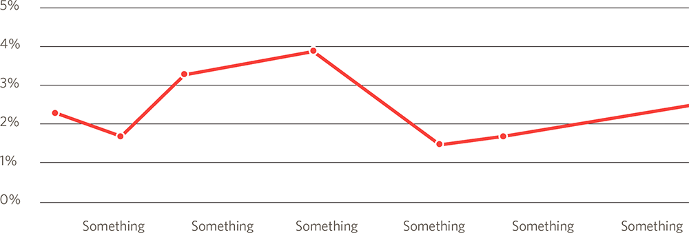
Charts and graphs
Charts and graphs should be styled as shown. Additional variations and chart types can be developed by any designer on staff as deemed necessary. These renderings do not require the specific approval of Nick — just a standard peer review and vetting.

Photography


Staff headshots are to be taken outdoors with natural lighting, and a shallow depth of field. Office photography is candid and naturally lit.
Portfolio photography

Wherever possible, portfolio work should be displayed in the environment that it’s used, and reflect the audience that it’s intended for. Consideration should be given to how the public engages with the brand and the specific application. In most cases, this imagery will require photo editing our work into Photoshop mock-ups and stock photography.